A brand new identity for a brand new type of business – Mountain Assurance.
James Thacker has always been about quality days in the mountains, guiding clients up the best climbs around the world. As a full UIAGM professional mountain guide James needed an identity for his new business venture – Mountain Assurance.
The following images and notes are to illustrate how many cycles of the process you may need to go around until you find the logo that shouts out as ‘something new’ and more relevantly fits the brief and is representative of who James is and what James does.
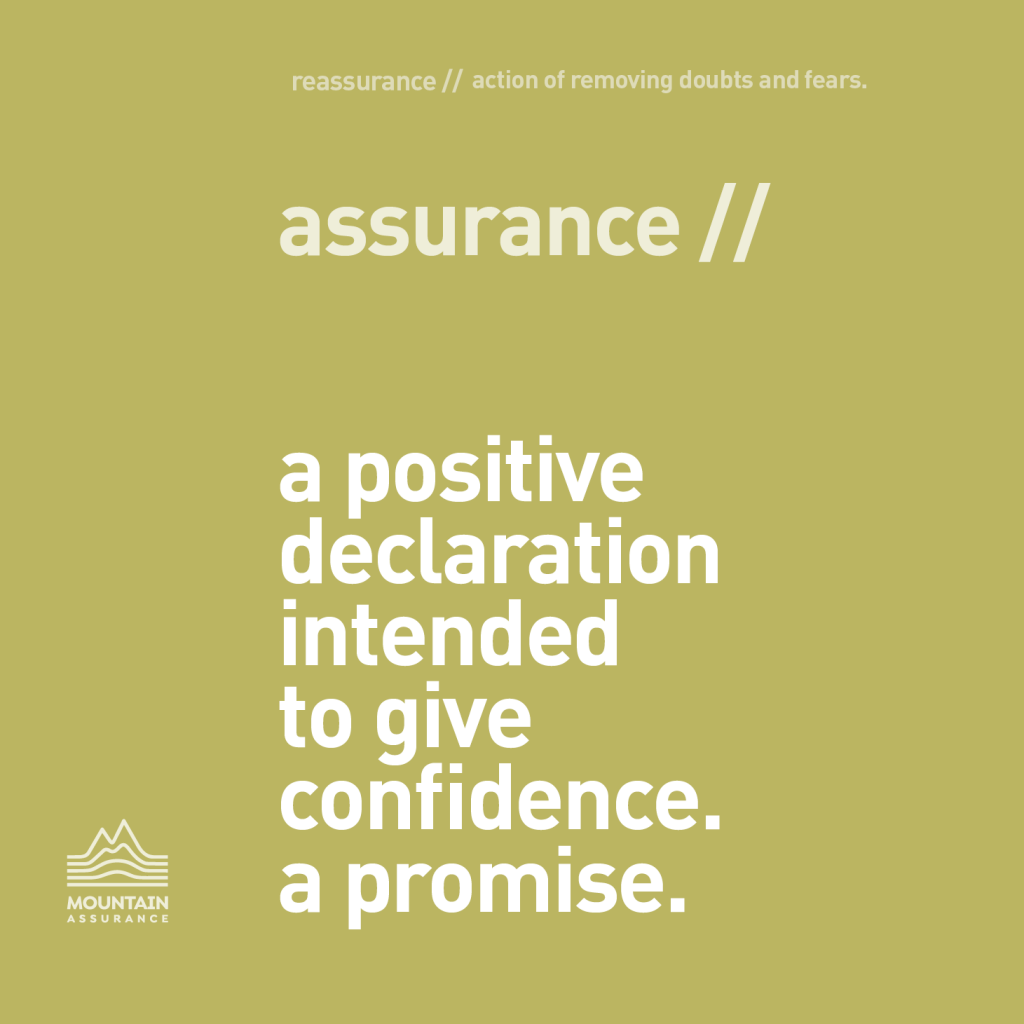
The starting place was the dictionary definition of assurance.
A surprisingly relevant definition for people venturing into the mountains under his watchful eye and calm mentoring.
‘assurance // a positive declaration intended to give confidence. a promise’.
The challenge was to create a logo that delivered ‘mountain’, a logo that was positive and altogether a fresh take on the more traditional expectations of a mountaineering logo.
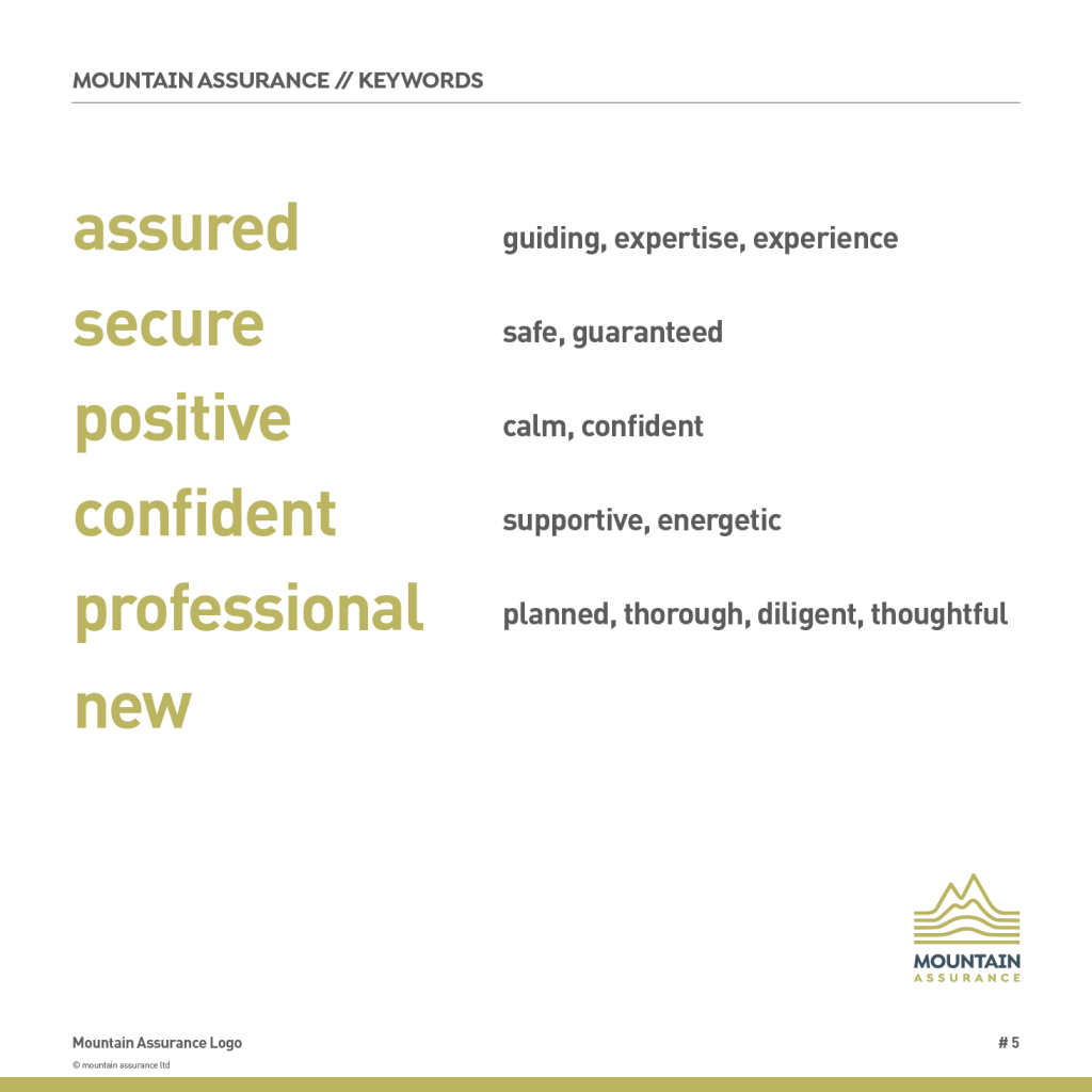
Above: The word map used for the logo.
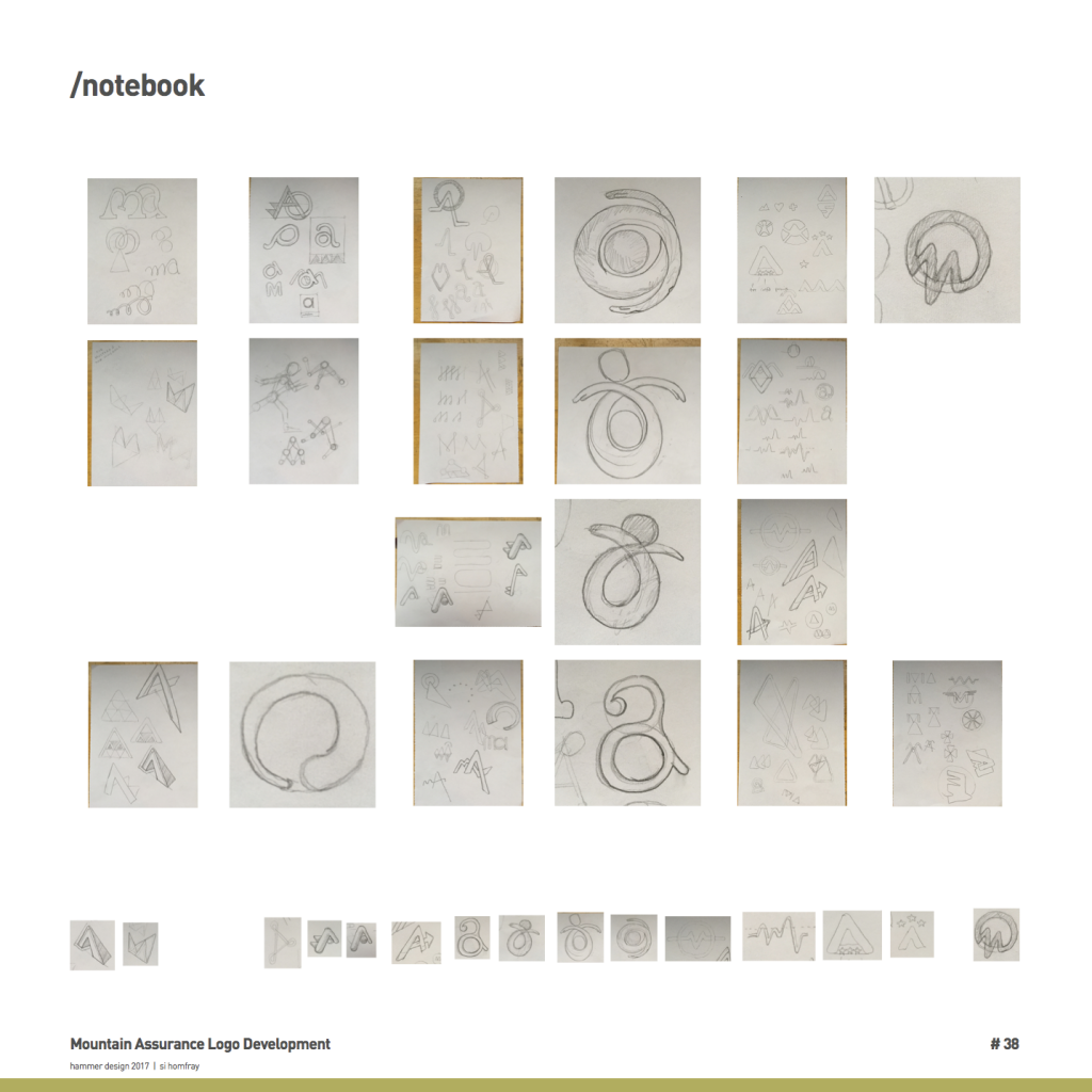
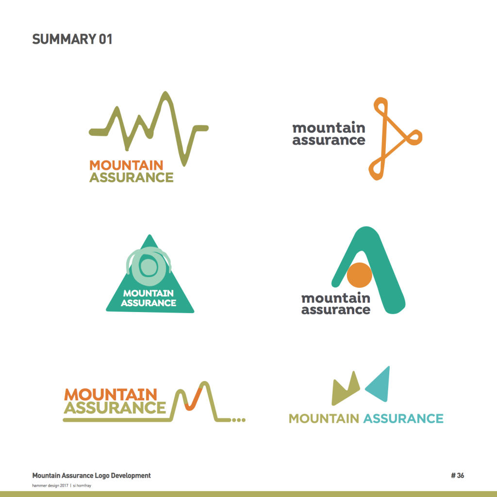
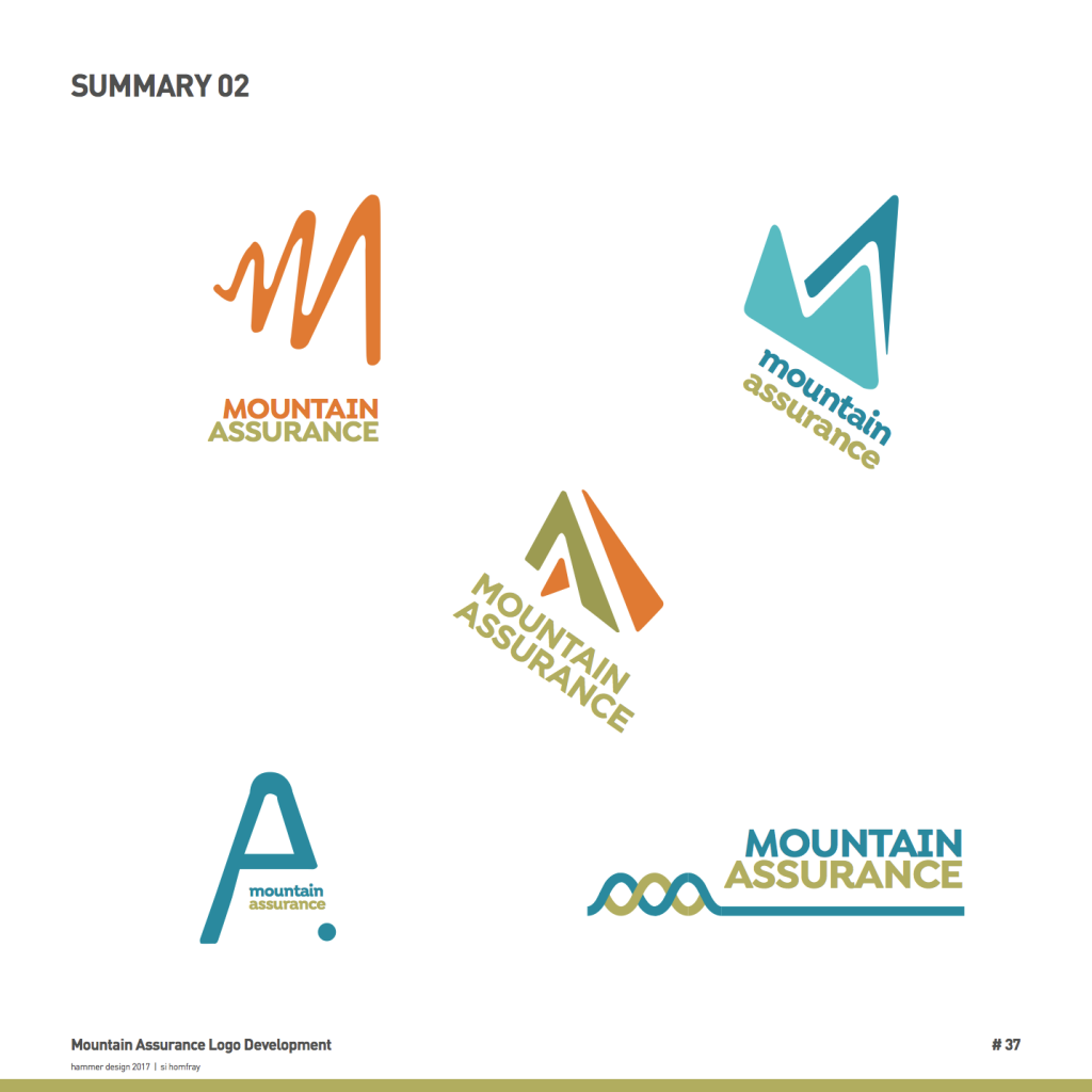
Above: Ropes, Knots, Hugs, and Ticks were all explored before settling for the more mountain obvious imagery.
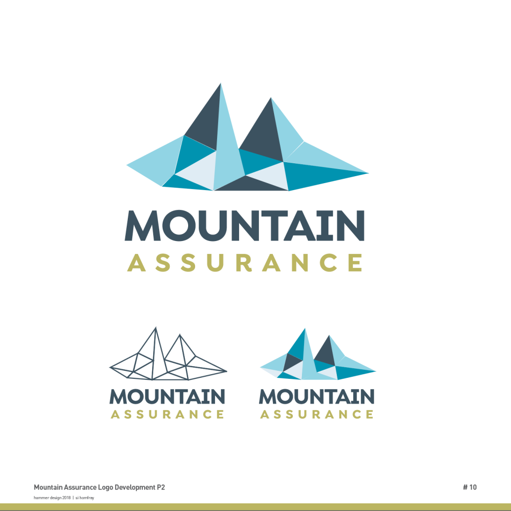
Above: The Mont Blanc super stylised triangles
This is strong but slightly less obvious without the text that it is about mountains. It’s an abstraction drawn from the Mont Blanc massif. This is a modern theme emerging more and more ‘the wire frame’. There’s hints of geology and crystals and diamonds in there which is cool. I think : )
The 3D topography ‘growing’ mountain
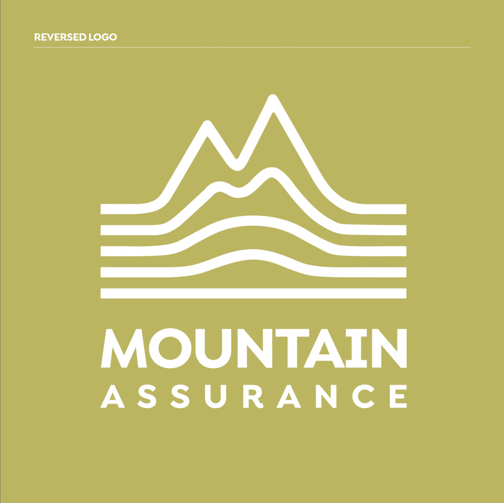
This is the final ‘sleeve’ design. It totally says mountains with bits of navigation, bits of 3D mapping and bits of growth. Its use on sleeve on garment could work really well. It’s strong in single colour and on image.
‘the growing mountain confidence logo’
A brave new kind of logo for a brave new name befitting his brave new business.
This was great fun, thanks James.
