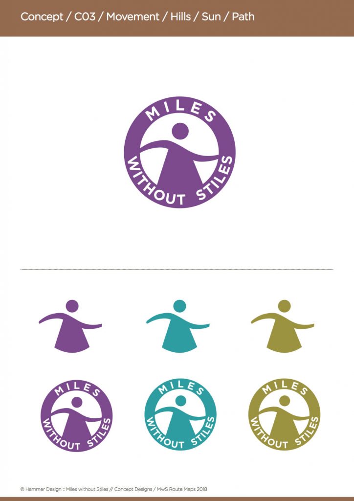
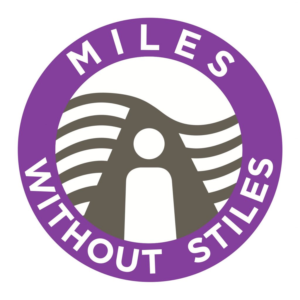
Having worked with Accessible Derbyshire’s Jane and Gillian for many years now, having attended many conferences and talked to people from all walks of life, all the various aspects and disciplines that are currently shaping the future of Accessibility in the UK right now and for the future, I was both honoured and humbled to be asked to create the new logo for Accessible Trails in the Peak District, with a view to it being probably being thrown nationwide shortly afterwards. A bit of a responsibility though!
The brief
To create a single graphic that tells the story of a person who now has access to outdoor places that were previously unavailable.
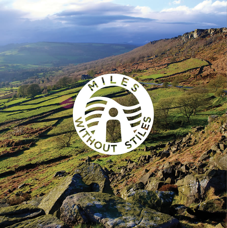
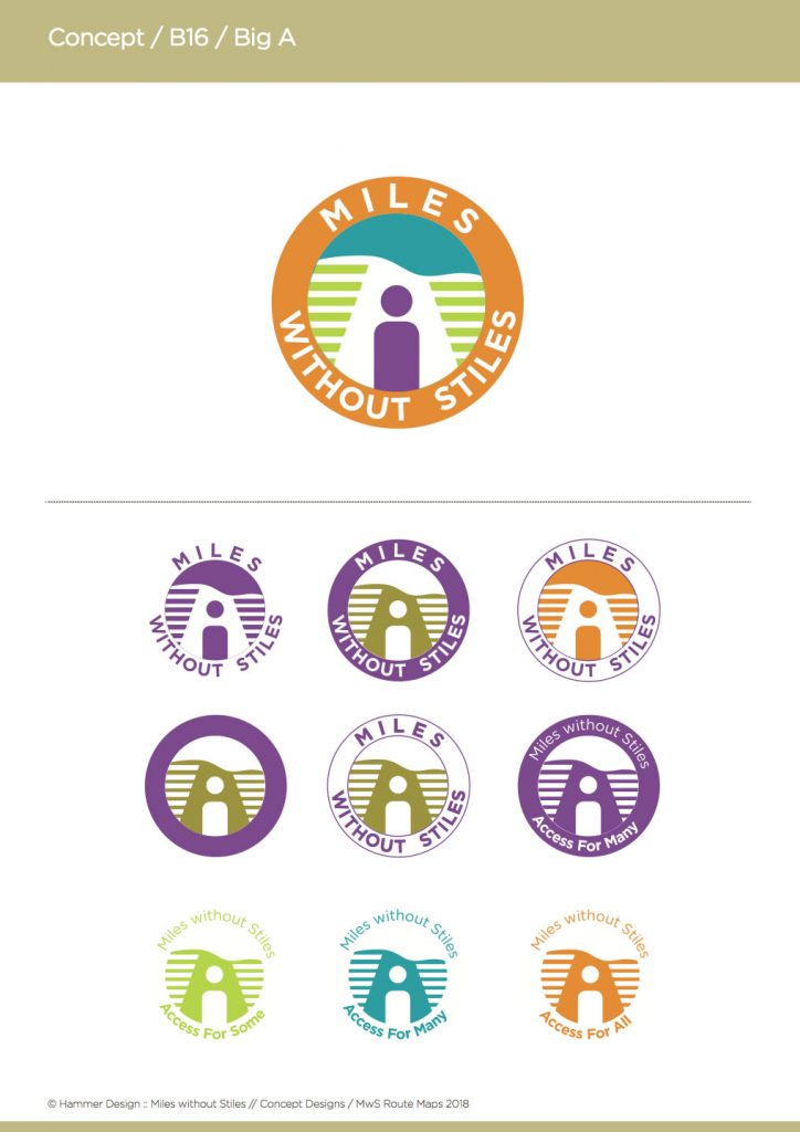
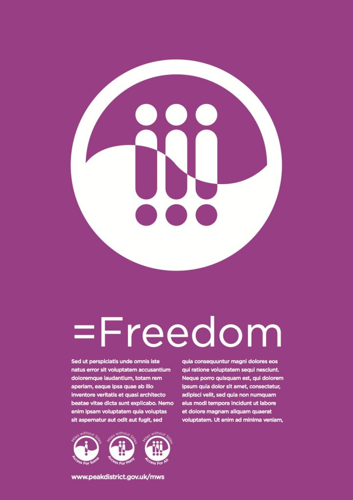
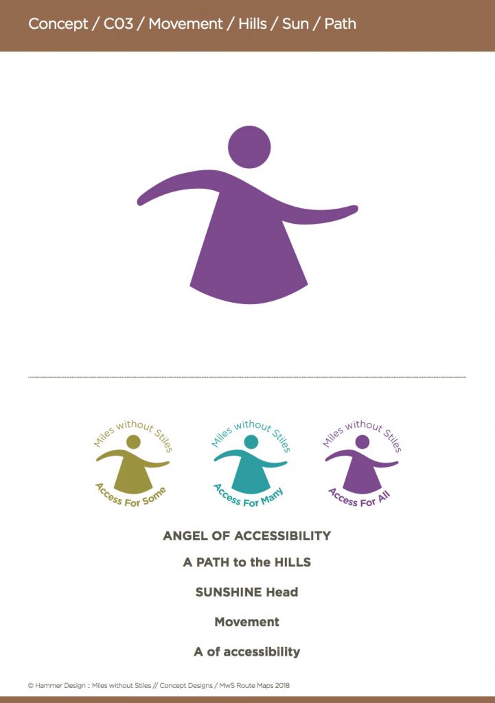
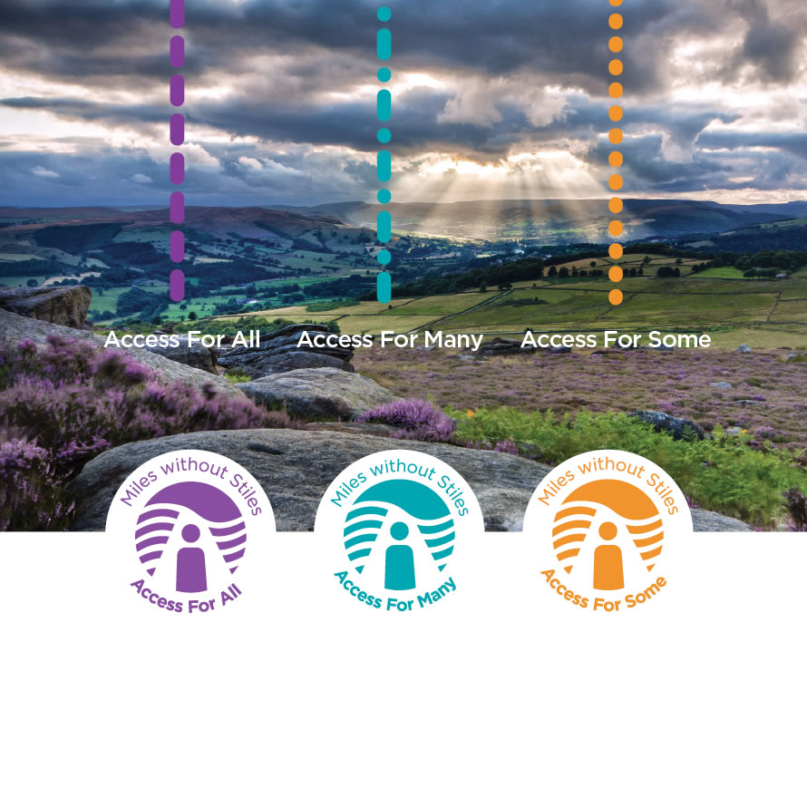
The principle graphic will also need be used in three supporting graphics as Access for Some, Access for Many and Access for All, the three grades of accessible routes.
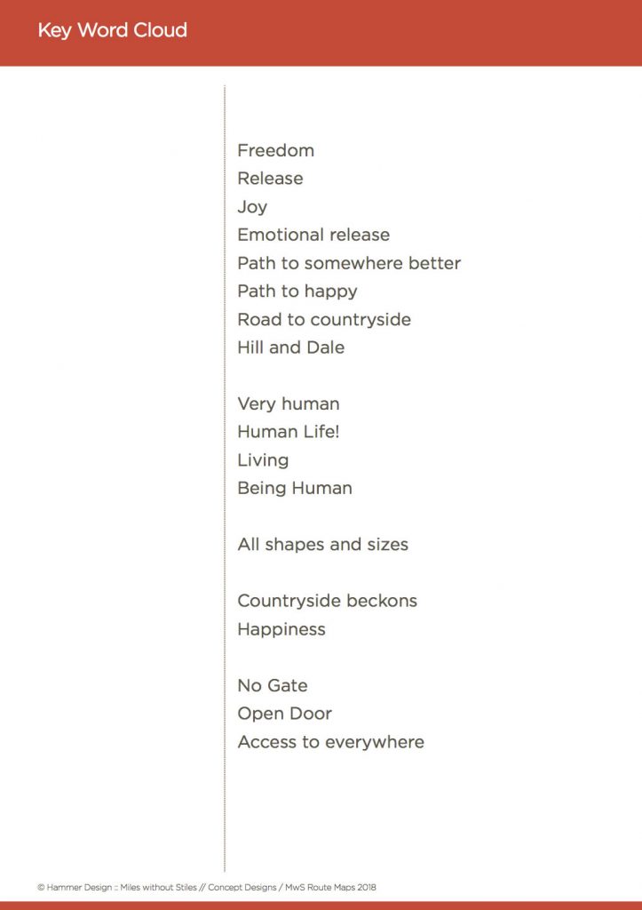
Ideally the logo, should convey some or all of the associated emotions and aspects from the Key Word Cloud (image below). A useful tool for maintaining the designers focus, and creating an effective symbol for communication.
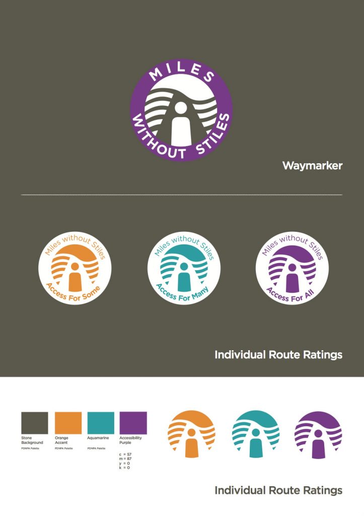
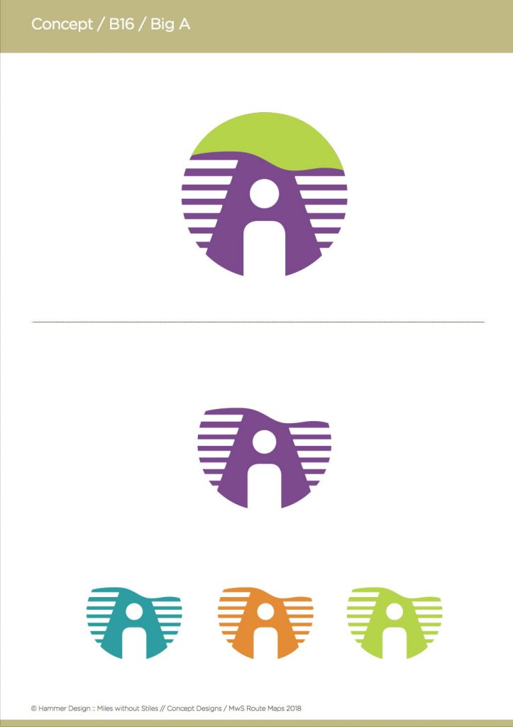
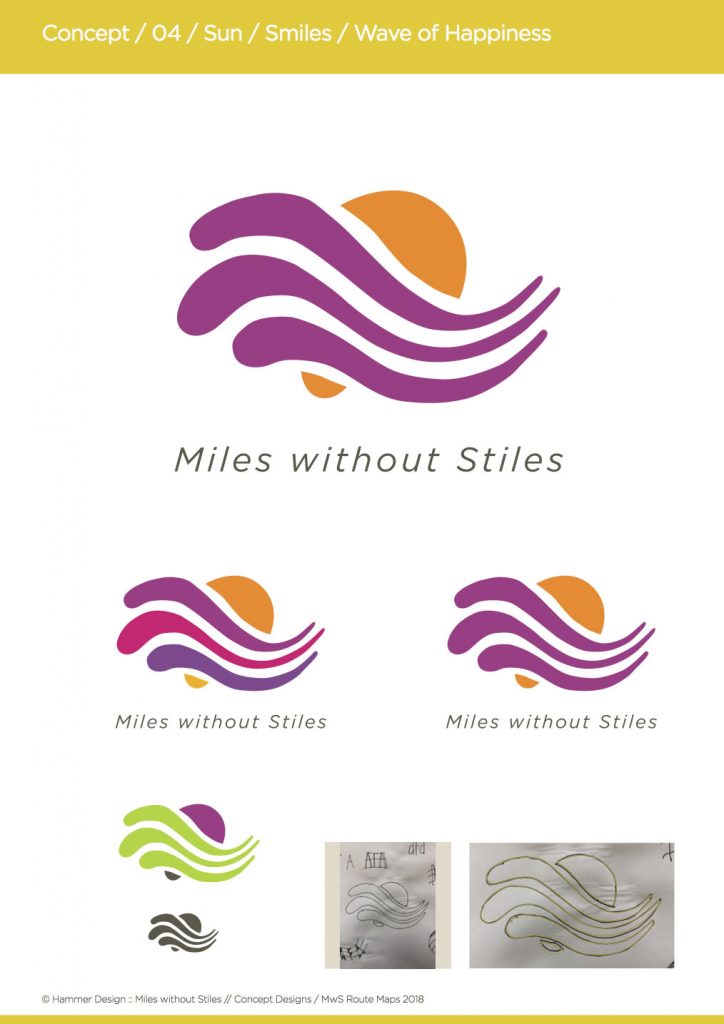
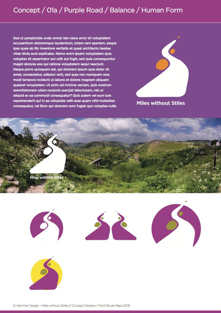
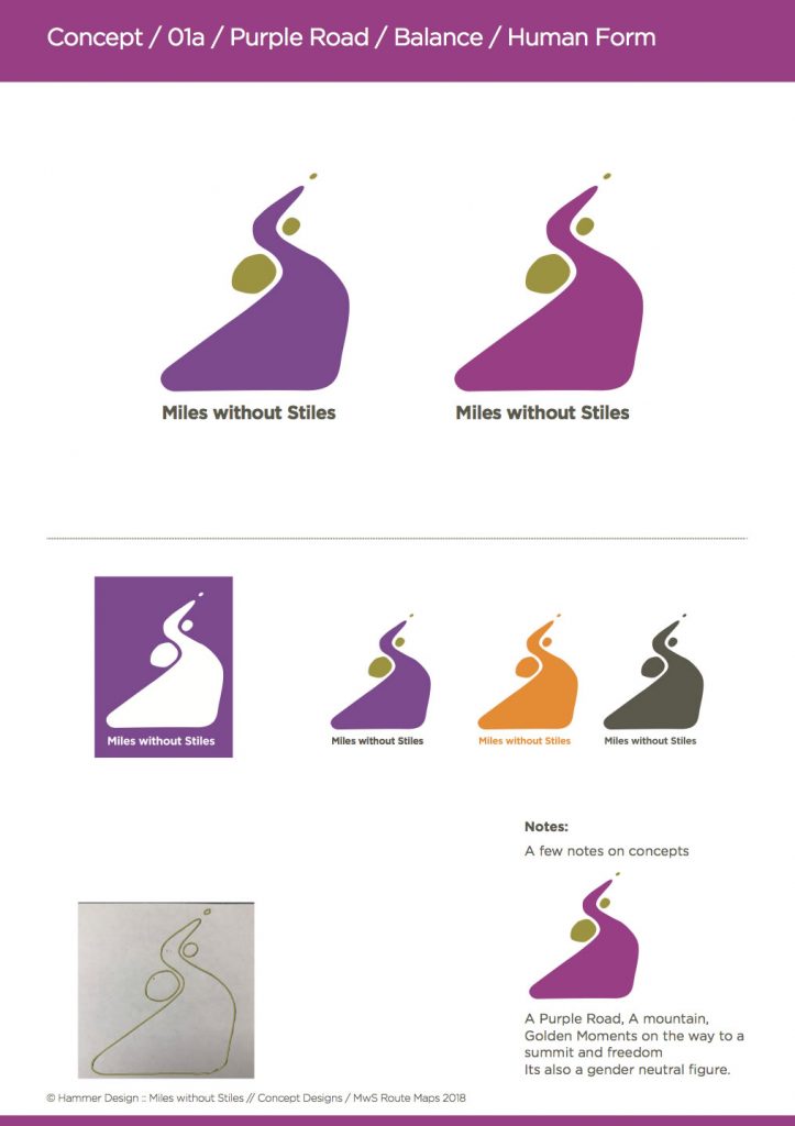
Below are a few of the earlier iterations of the logo as it was developed:
The Accessibility Angel of freedom (images below), was felt to be too free, and whereas it ticked all the boxes for simplicity, fresh form, hills, sunset, movement and clarity for a waymarker… it was rejected in favour of the ‘person on the road’ in the ‘A for accessibility’ that was finally settled on.
In summary, the design project was quite joyous. A project well worth doing well, it was a totally thorough process, taking up hundreds of sketches, and running over several months. A final push, with some frank and open discussions delivered a marque, which gives me a great deal of pride.
A few words from the client:
Thank you for your work on a logo which will become known as a symbol for access and accessibility. Thank you for the icon development for the routes which will help people to expand their horizons. Thank you for the wow factor for the handbook. I’m impressed and delighted that you’re involved.
Sue.
